Rhombus
Responsive Fintech Dashboard
Project Overview
Problem
Sole proprietors and freelancers have limited bookkeeping options; often they are one-size-fits-all solutions that are difficult to use, joyless, and expensive. This results in many users procrastinating their bookkeeping tasks or incurring significant costs to outsource the work, negatively affecting profitability and efficiency.
Solution
Users want a bookkeeping experience that is customizable, fun, and easy to navigate. Rhombus meets this need with a vibrant, user-friendly dashboard that can be tailored to fit each person’s unique needs, making bookkeeping more efficient and enjoyable.
Contribution | Team
UX/UI, Brand, Prototype + Testing | mentored by Anna Brenner
TL;DR
Short on Time?
Here’s a quick 2-minute preview of the final product, starting with a concise elevator pitch that outlines what the product is and how it meets users' needs, followed by a few key prototypes.
Elevator Pitch
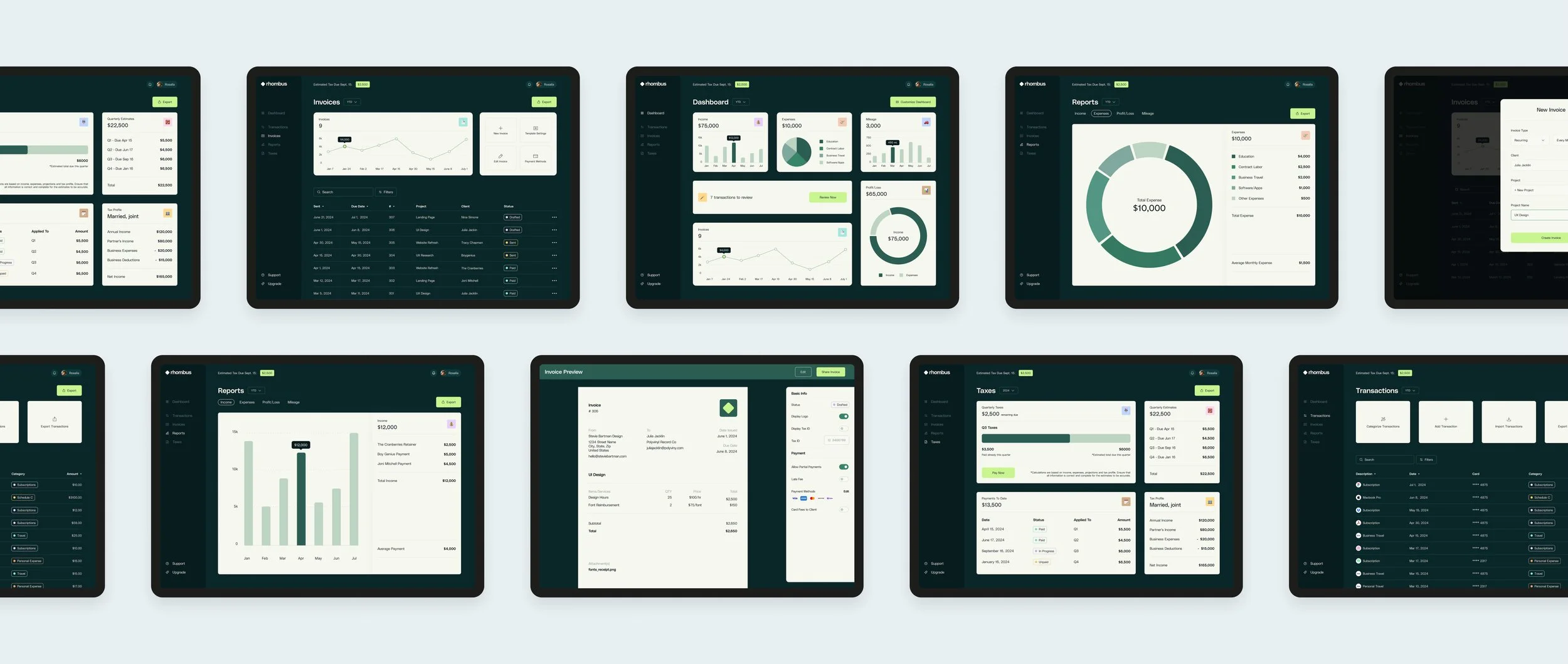
Rhombus is a customizable bookkeeping solution designed for solopreneurs, that simplifies and personalizes financial tracking empowering users with the flexibility and control they need. Its MVP release includes key features like income, expense, and mileage tracking, transaction management, invoicing, tax tools, and profit/loss reporting.
Prototypes
Want previews of the finished interface? Below are interactive prototypes of 3 key flows.
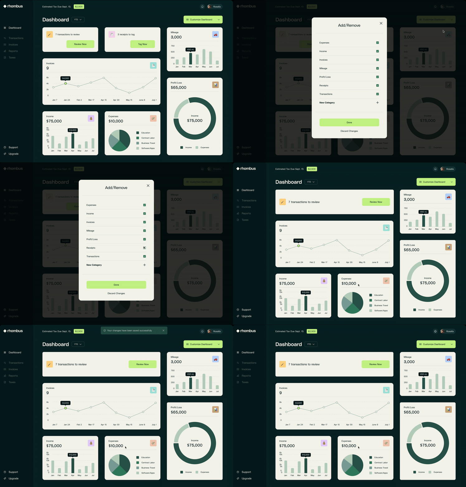
The first flow introduces the customization feature, enabling users to effortlessly add and remove modules from the dashboard, with automatically resizing modules.
Customization Flow
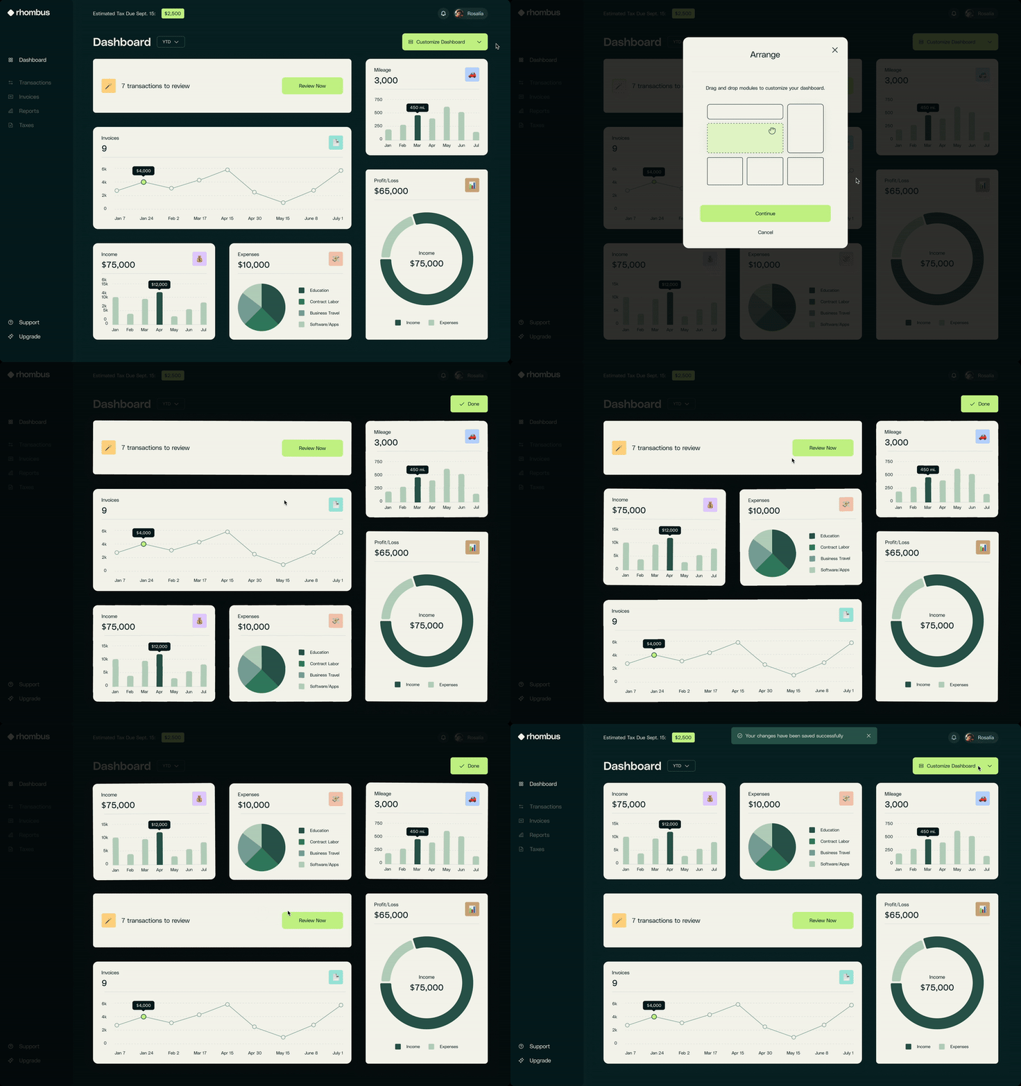
Drag and Drop Modules
The second customization flow allows users to drag and drop modules to prioritize the layout according to their preferences. This interactivity empowers users to arrange the modules in a way that enhances their workflow and personalizes their experience, making it easier to focus on the most relevant information at a glance.
Invoice Flow
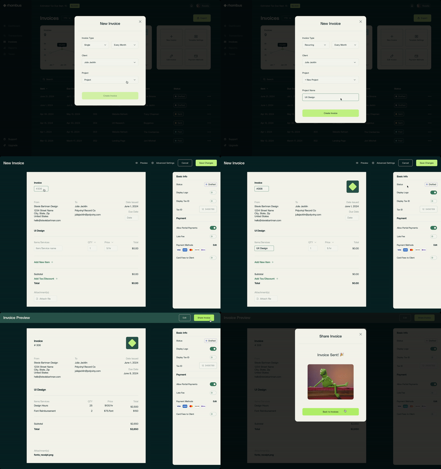
Make a New Invoice
This flow incorporates modals at the start to streamline the invoice creation process, reducing the need for users to repeatedly enter the same details for each invoice. By pre-populating fields, it minimizes data input friction, making it quicker and easier for users to generate invoices with less manual entry.
Deeper Dive? Keep Reading for the Full Case Study 👀
Affinity Mapping
User Interviews
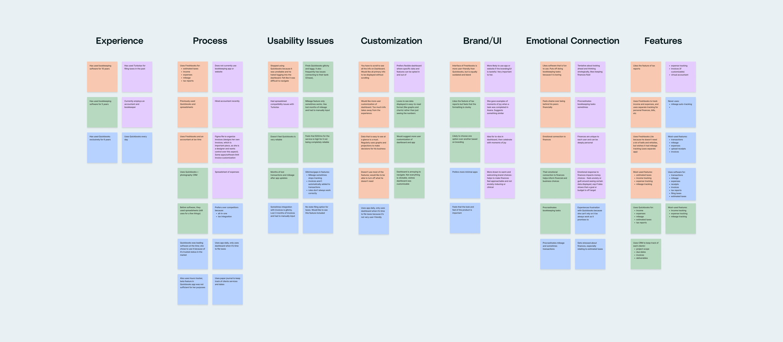
Four small business owners and freelancers were interviewed to understand their bookkeeping processes and level of satisfaction with their current products. Using affinity mapping, I categorized their responses into seven key areas: Experience, Process, Usability Issues, Customization, Brand/UI, Emotional Connection, and Features.
Insights
Insights from User Interviews
Five key insights guided the focus of this project. Interviews revealed that Rhombus’ target users:
Are frustrated with the lack of customization available in one-size-fits-all products they currently use.
Users frequently rely on multiple products or hire costly professionals for bookkeeping, resulting in lost time and expense.
Often feel anxious about bookkeeping tasks, leading to procrastination or avoidance.
Have unique responses to data visualization—some find it encouraging, while others feel shame or avoidance, especially when shown unfavorable data.
Users cite usability issues as a major dissatisfaction with current tools, including poor responsive design, gaps in mileage tracking, and frequent app crashes.
Competitive Analysis
Evaluating Bookkeeping Competitors
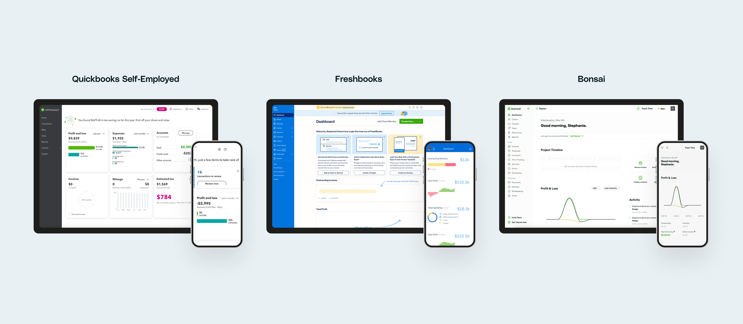
What similar products are currently available, and how well do they work? The next step was to examine three bookkeeping solutions available to sole proprietors and freelancers to identify competitor’s strengths and weaknesses and uncover opportunities to streamline and enhance the user experience.
QuickBooks
Pros:
Comprehensive Features: All the features that interviewees expressed they need are represented.
Established Platform: It is the most widely-used bookkeeping software, with an established presence in the market.
Cons:
Poor Responsive Design: The software struggles with responsive design, impacting usability on different devices.
Inconsistent Interactivity: Charts and cards are sometimes clickable, sometimes not, leading to a frustrating user experience.
App Stability Issues: Users report frequent crashes and have experienced periods of missing mileage data.
No Customization Options: Lacks the ability to customize the interface to better suit individual needs.
FreshBooks
Pros:
Robust Features: They offer a wide range of features, making it especially suitable for companies with employees.
User-Friendly Interface: The UI is friendly and approachable, aiding ease of use.
Free Trial: A one-month free trial helps users acclimate to the product before committing.
Cons:
Cluttered Interface: The interface is cluttered with too many unnecessary options for sole proprietors.
No Customization Options: Users cannot personalize the dashboard or other features.
No Mileage Tracking: The software lacks a mileage tracking feature.
Scrolling Required: Users have to scroll to see all the information on the dashboard, which can be inconvenient.
Bonsai
Pros:
Clean Interface: Bonsai offers a beautiful, clean and inviting interface.
Ease of Use: Is easy to use with a minimal learning curve, enhancing the user experience.
Free Trial: Provides a one-month free trial to help users get used to the product.
Cons:
No Mileage Tracking: Bonsai does not include a mileage tracking feature.
No Customization Options: The interface cannot be customized to fit individual user needs.
Scrolling Required: Users need to scroll to see all the information on the dashboard, which can detract from the user experience.
Takeaways
QuickBooks stands out for its comprehensive features and trusted platform but suffers from poor responsive design and stability issues. FreshBooks is robust and user-friendly, yet cluttered and lacks customization and mileage tracking. Bonsai excels in ease of use and aesthetic appeal but also misses out on customization and mileage tracking features. Each product has its strengths and weaknesses, highlighting different areas for potential improvement and user satisfaction.
User Personas
Comprehensive User Representation
Personas were created by drawing directly from interviewees’ real experiences, pain points, and needs as well as information gathered from secondary research. These personas represent various types of users who interact with the app differently: beginners and experienced users, pragmatic and emotional users, users looking for more or less features. These personas provide a roadmap to understanding user needs, behaviors, motivations and goals, offering valuable insights into the overall user experience.
Sitemap
Centralized Dashboard Navigation
In designing Rhombus' sitemap, it was essential to create a seamless user experience by making all features accessible directly from the dashboard, whether through modules or the navigation bar. This centralization ensured users could quickly find any function they needed, reducing time spent scrolling or searching. All dashboard modules would later be designed to be responsive and clickable, enhancing usability. The next priority was to streamline task completion, minimizing the number of steps and reducing friction By streamlining the process, we aimed to boost user satisfaction and efficiency, so users can focus on their business instead of on navigating the app.
Low-Fidelity Wireframes
Early Customization Flow Sketches
User interviews revealed a core user need for a customizable interface. This insight led to a focus on developing a drag-and-drop dashboard customization experience. Initially, I considered more complex concepts where users could choose module styles and customize their size and positioning. However, it was decided this level of customization was unnecessary and overly demanding for developers.
Instead, I landed on a flow where users choose which modules to include on the homepage, and the app resizes them to fill the space. They can then drag and drop the modules to organize their dashboard according to personal preference. I sketched various iterations of customizable modules of different sizes and quantities, as shown in the graphic.
Mid-Fidelity Wireframes
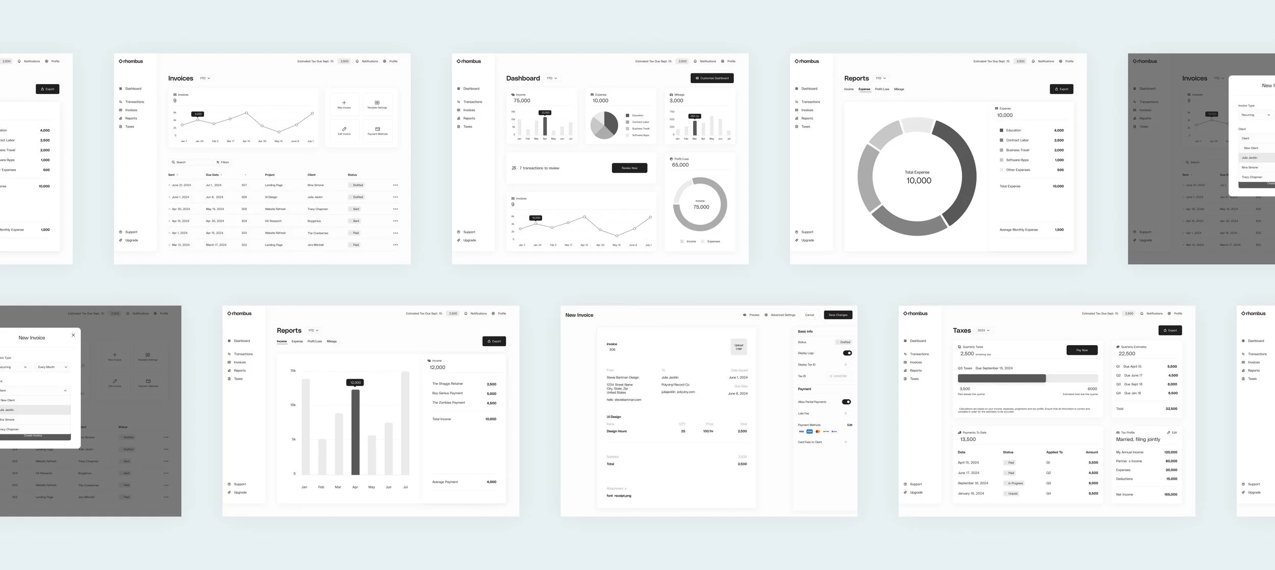
Wireframing Key Features Based on User Feedback
Using information from interview participants on their most-used and essential functionalities, along with successful pattern examples from the competitor analysis, I developed wireframes for the following key features:
Income Tracking
Expense Tracking
Mileage Tracking
Transactions Management
Invoice Management
Profit/Loss Reports
Tax Management
For the MVP release, I concentrated on these core features, with plans to explore client and project management functionalities following a successful reception of the initial release.
Dashboard Design
Building an Engaging and Responsive Dashboard
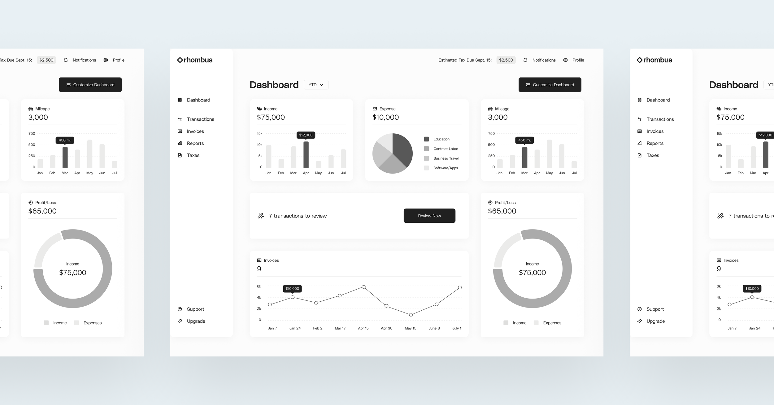
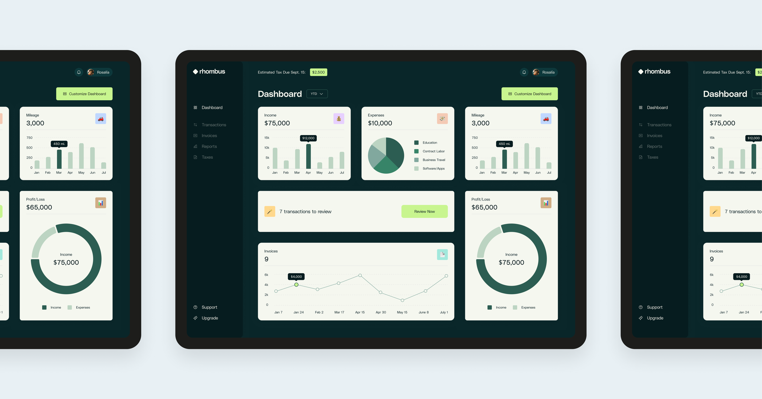
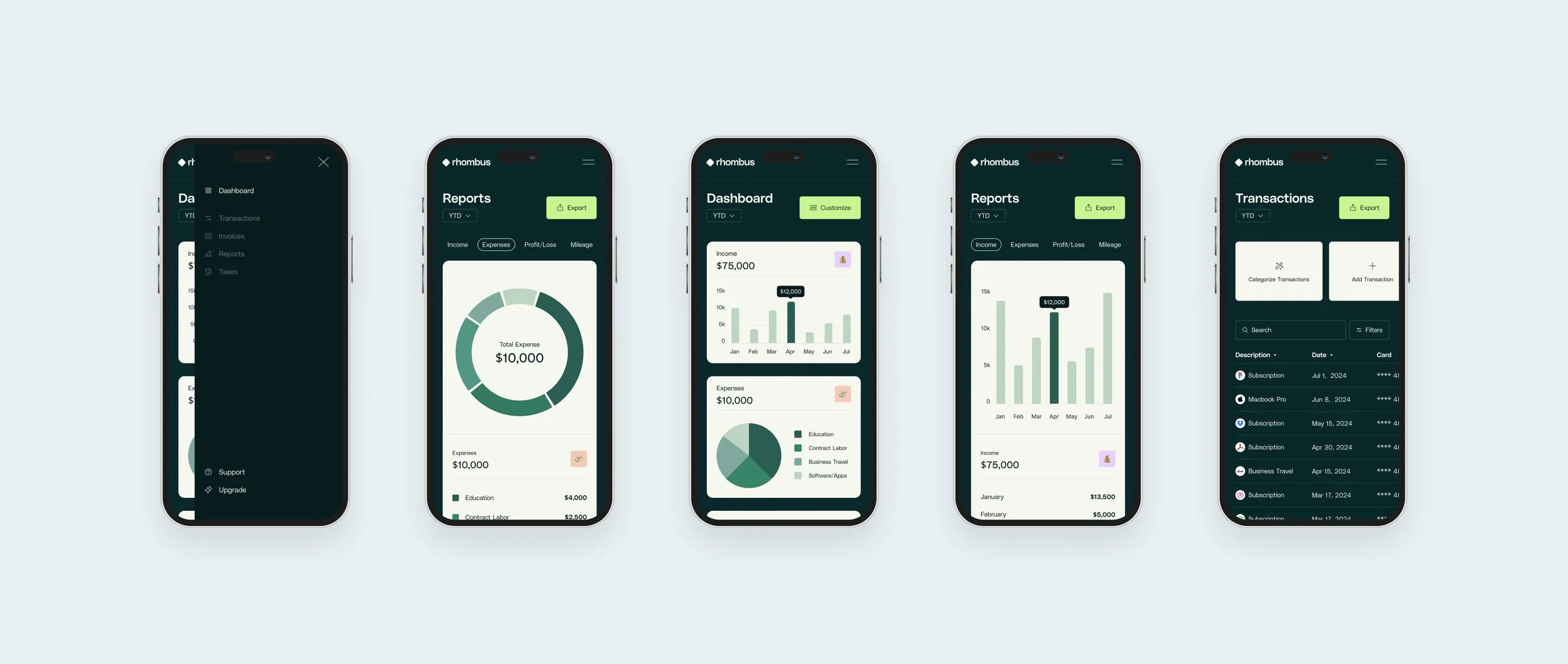
The dashboard design was carefully considered to ensure all elements were fully responsive and every module was clickable, providing a seamless user experience across different devices. Following some iteration, module dimensions were optimized to be able to make the transition from desktop to mobile with minimal resizing, ensuring consistency and ease of use regardless of the device.
User interviews highlighted the importance of integrating graphs and charts as core components of the dashboard. Users wanted the option to display or hide visualizations, allowing them to customize their view and remove specific modules. These data visualizations needed to be clear, engaging, and scalable, ensuring they provided valuable insights while maintaining a user-friendly and visually appealing interface.
Usability Testing
User Feedback
I used Maze to conduct moderated user testing. Users were asked to complete two unique user flows: Creating a New Invoice and Customizing the Dashboard.
What Went Well
Overall, the test was very successful. Completion rate was 100%, and the misclick rate was low (1.9% over all screens). Most misclicks were actually correct interactions, but simply not included in my prototype! Were I to complete user testing a second time, I would revise the prototypes to include more navigation solutions and avoid this!
Additionally, and perhaps most importantly, 100% of testers reported that they would use Rhombus over the product(s) they currently use.
Opportunities for Improvement
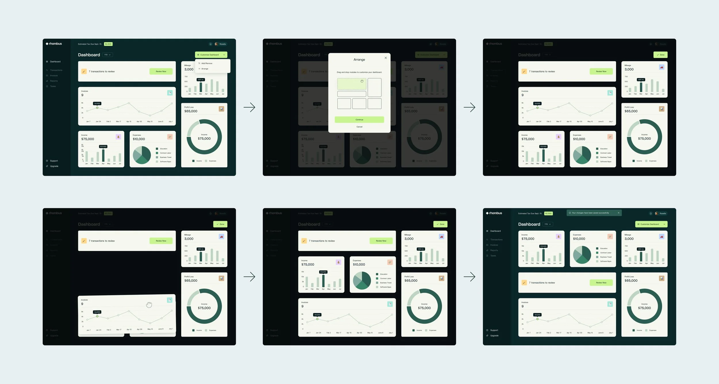
I noticed some confusion and hesitation during the drag and drop section of the customization flow. In the initial design, users would click the Customize Dashboard CTA, choose from the dropdown to either Add/Remove or Customize, and upon choosing to customize, would be taken directly to the customization screen where they would drag and drop modules into place. Two users clicked instead of dragging on their first try. Understanding this as a potential frustration point for some users, I added additional affordance to make the interaction options more obvious.
To address this issue, I:
Added an animation to the prototype to make the modules “jiggle,” similar to the way apps move when customizing the app layout on iOS.
Increased background opacity so users know they can only interact with the modules and the CTA.
Introduced a modal with a short GIF tutorial showing users how to drag and drop modules.
Below is a condensed view of the revised Customize Dashboard experience. The prototype at the end of this case study offers a more comprehensive look into the functionality, and I highly recommend trying it for a fuller understanding of the flow.
Brand and UI Guidelines
Establishing a Strong Visual Identity for Rhombus
The name 'Rhombus' emerged from the realization that blending a strong sense of trust with a touch of fun was key to getting users excited about managing the less-fun parts of their business. User responses were unanimous: every user wanted a tool that would not only handle bookkeeping tasks seamlessly, but also spark a positive emotional connection.
Logo
The logo’s shape is much like a square, a symbol of sturdiness and strength. Flipped on it’s side, it becomes a rhombus, evoking a balance between reliability and playfulness!
Typography
To help achieve a sturdy, but approachable feel, Polysans is used throughout.
Color
Muted dark greens evoke a grounded and trustworthy fintech tone, while brighter CTAs and playful emoji icons add modernity and vibrancy.
User Interface
UI Objectives and Design Strategy
A key UI objective was to design simple, responsive pages featuring easily digestible graphs and charts. These charts and graphs needed to adapt seamlessly to different screen sizes, offering a smaller, simplified version on the dashboard and an expanded version when clicked. This approach ensured users could quickly access key data at a glance while also having the option to delve into more detailed information.
Additionally, it was essential to minimize the learning curve and the number of unique pages to navigate. Grouping four features, Income, Expenses, Profit/Loss and Mileage, into a "Reports" navigation tab emerged as an effective solution. This strategy not only minimized the number of individual screens that needed to be designed but also streamlined the user experience. By consolidating these features, users could navigate fewer page patterns and more efficiently find the information they needed.
Dashboard UI
Integrating User Insights for a Personalized Dashboard
The UI priority for the dashboard was to design clean, clear, and scalable modules for easy data visualization, navigation, and customization. The process followed the established wireframe patterns and was informed by secondary research to ensure a user-friendly and visually appealing design.
Various ideas were considered for the dashboard’s primary call to action. However, user feedback indicated that the primary button should focus on customization, emphasizing the user need for personalization.
The introduction of vibrant CTAs and emoji icons into the dashboard aimed to enhance the interface's appeal and approachability.
Invoice Flow
User-Friendly Invoice Workflow
The invoice flow was designed with simplicity and efficiency in mind. The process begins with a user-friendly interface that guides users through creating a new invoice step by step. Information is added by the user via a modal before the invoice is generated, choosing from new or existing clients and projects. This allows for auto-population of certain fields, saving time and reducing errors. Once the invoice is populated, all form fields are clickable and editable, ensuring flexibility and ease of use. Upon completion, a moment of delight rewards the user. This design addresses the need for efficient task completion while delivering a gratifying user experience.
Mobile Design
Designing a Mobile-Optimized Experience
When planning the initial desktop dashboard designs, it was important to consider responsiveness. User feedback indicated that while most users wanted to complete basic bookkeeping tasks on mobile, they preferred to reserve more complex or graph-heavy tasks for desktop, so I focused a great deal of attention on the desktop version in the early stages.
In hindsight, it would have benefited the project to prioritize designing modules for mobile first, then translating those designs into the desktop dashboard experience. The tedium of making repetitive, minor scaling adjustments to each module later on was a valuable lesson in the importance of thoughtful planning and a carefully considered UX order of operations. I loved learning and growing through the process!
Prototype
Following Two User Flows
Using the prototype embedded below, users can complete two unique user flows: Creating a New Invoice and Customizing the Dashboard.
The invoice path is straightforward and simple, and provides the user a moment of delight upon task completion. This fun addition received very positive feedback from the test group!
In the dashboard customization flow, users navigate through two customization areas. First, they can remove a module from the dashboard, with the adjacent module automatically expanding to fill the space. Second, users can reorganize the dashboard by dragging and dropping two modules downward, simulating the post-development experience
Conclusion
Key Problems
In the initial stages of developing Rhombus, several critical problems were identified. Rhombus’ target users:
Experienced frustration with the lack of customization in one-size-fits-all products they were using
Often relied on multiple products or hired costly professionals, resulting in wasted time and expense
Felt anxious about bookkeeping tasks, leading to procrastination or avoidance
Had diverse responses to data visualization—some found it encouraging, while others experienced feelings of shame or avoidance when confronted with unfavorable data
Cited usability issues as a major source of dissatisfaction with current tools, including poor responsive design, gaps in mileage tracking, and frequent app crashes
Key Solutions
Rhombus addressed these user needs with a vibrant, user-friendly dashboard that can be tailored to each person’s unique preferences, making bookkeeping more efficient and enjoyable. The key solutions are outlined below.
Customizable Dashboard: Implemented a customizable dashboard to address frustrations with one-size-fits-all products
Integrated Bookkeeping: Combined key bookkeeping features into a single platform, reducing reliance on multiple products and costly professionals
User-Friendly Tools: Designed features to make bookkeeping tasks less intimidating and more enjoyable, reducing user anxiety and procrastination
Adaptive Data Visualization: Created data visualization options that are sensitive to users' emotional responses, including customizable views to avoid negative feelings
Enhanced Responsiveness: Made the design fully responsive, providing a reliable alternative to frequently problematic apps
Reflection
Insights
This project resonated with me on a personal level. As a business owner for the past 11 years, I've encountered many talented, hardworking solopreneurs who unfortunately struggle with the bookkeeping side of things. It was fulfilling to design a product that would help individuals take control of the less-glamorous aspects of entrepreneurship with ease.
This experience also underscored the importance of iterative design and user feedback. The back-and-forth process highlighted the symbiotic dynamic between user and designer!
Improvements Roadmap
I am excited to explore how Rhombus can continue to evolve and better serve its user base. Here are a few ideas for further enhancement:
Further develop and refine existing features
Add features for client and project management
Conduct another round of user testing
Introduce more options for customization
Add the ability to reorder the dashboard modules to prioritize each user’s most-used modules
Include more aesthetic considerations like having a light mode option and the ability to control the icon theme


